
what is a genre?
a style or category of art, music, or literature. Different types of genres are beneficial as they would be able to target different types of people (audience).
what is a magazine?
a periodical publication containing articles and illustrations, often on a particular subject or aimed at a particular readership.
Differences between digital and print magazines:
A digital edition is an online magazine or online newspaper delivered in electronic form which is formatted identically to the print version. Digital editions are often called digital facsimiles to underline the likeness to the print version.
A printed magazine is a publication, usually a periodical publication, which is printed or electronically published (sometimes referred to as an online magazine).
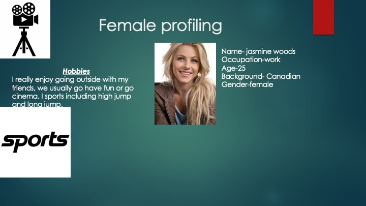
Demographic- age/gender/race/income/ethnicity/occupations/annual income/the statistical characteristics of human populations (such as age or income) used especially to identify markets
psychographic -attitude/activities/personality and valuesAnalysis of consumer lifestyles to create a detailed customer profile. Market researchers conduct psychographic research by asking consumers to agree or disagree with activities, interests, and opinions statements. Results of this exercise are combined with geographic (place of work or residence) demographic (age, education, occupation, etc.) characteristics to develop a more 'lifelike' portrait of the targeted consumer segment.
geographic- local/regional/national/international
a periodical publication containing articles and illustrations, often on a particular subject or aimed at a particular readership.
Differences between digital and print magazines:
A digital edition is an online magazine or online newspaper delivered in electronic form which is formatted identically to the print version. Digital editions are often called digital facsimiles to underline the likeness to the print version.
A printed magazine is a publication, usually a periodical publication, which is printed or electronically published (sometimes referred to as an online magazine).
Demographic- age/gender/race/income/ethnicity/occupations/annual income/the statistical characteristics of human populations (such as age or income) used especially to identify markets
psychographic -attitude/activities/personality and valuesAnalysis of consumer lifestyles to create a detailed customer profile. Market researchers conduct psychographic research by asking consumers to agree or disagree with activities, interests, and opinions statements. Results of this exercise are combined with geographic (place of work or residence) demographic (age, education, occupation, etc.) characteristics to develop a more 'lifelike' portrait of the targeted consumer segment.
geographic- local/regional/national/international
Different types of magazines:

aim entainment magazines-these magazines are usually aimed at most of the public.
In every issue of Total Film, you'll find:

tEntertainment magazines-these magazines are usually aimed at most of the public.
no age requirement needed.animals and pets - this would target animal lovers and people who take care of animas in shelters etc.Get up close to the most impressive animals on Earth and prepare to be amazed. Discover the planet’s toughest survivors as we examine the extremophiles that can endure searing heat, freezing winds, low oxygen and crushing pressure. Take a look at some of the biggest, fastest, strongest and most dangerous animals on Earth, and learn all about how they’ve adapted to thrive in such unique habitats. Meet animals with brainpower beyond belief, including apes, orcas and crows, and become acquainted with the smelliest and loudest creatures in the world. (any age) this magazine is usually aimed at everyone, any gender |

this would have a target audience of the people who are into cars and are probably running a business which involves cars. Immerse yourself in the innovative world of the electric car as we investigate every facet behind the automotive sector's exciting new technology. Learn all about the cutting-edge science behind electric vehicles (EVs) and plug-in hybrid electric vehicles (PHEVs) and the infrastructure being put in place to make them a viable option to the internal combustion engine. The audience could be any age. any gender

gaming magazines have a toll on a lot of young people, even some older people. Gaming magazines could be made for an competitive purpose as there are many competitions for each game which award cash prizes this could fall into the category of everyday activities as many teenagers do this.Shooter Special! We get to grips with the year’s best new shooters, including Doom Eternal, Call Of Duty Modern Warfare and the Xbox-only Gears 5! We also take a look at the six shooters that changed it all, those hugely influential Xbox games that informed the latest generation of shooters. Elsewhere we speak to the games industry’s finest concept artists and showcase some of their work, and we bring you all the news, reviews and previews of up-and-coming Xbox games.
mainly aimed for boys/men age - 12-40 Plus great gifts, including a set of four Pro Thumb Grips, digital Fortnite Player’s Guide and awesome dashboard backgrounds for your Xbox. |

space magazine : space magazines give you a sense of wonder as it talks about outer space and what could be lurking in space....
In every issue of All About Space, you'll find:
In every issue of All About Space, you'll find:
- Stargazer: Packed with product reviews, star charts and tutorials, All About Space offers a complete guide to the night sky for astronomers – whatever your level of experience.
- Launch Pad: A stunning array of images and facts, plus our round-up of the latest space-related news.
- Future Tech: From interstellar spacecraft travelling between the stars to colonising the surface of Venus, discover the out-of-this-world concepts tipped to assist in the future of space exploration.
- Heroes of Space: Meet the astronauts and scientists behind the discoveries and insights into our wonderfully mysterious universe.
- User Manual: in the know about the workings of the missions that have allowed us to explore the cosmos like never before.
- Amazing Facts: Discover something new with every issue and be awed by the fascinating wonders that occur beyond the Earth’s atmosphere. - age (9-60) space magazines would only interest people who like the idea of space and the galaxy but the magazine is for anyone. any gender is welcome to see.
|
|
digital vs print
DIGITAL VS PRNT
These comparisons should include:
Print magazines were a popular way of keeping up with the news around the world, costing at £5+ for a magazine. The production of a magazine is very expensive about 112.50 per page. So a 64-page plus cover magazine would cost 7.650 for production design with art direction. (information taken from print magazine cost) but as technology ha developed we now often read news through “digital magazines”.
Digital magazines are a better way of catching up with the latest news of what’s happening through your phone (but you will need to buy a subscription of 7.99 a month). Buying a digital magazine subscription or a single digital issue means you'll benefit from being able to download the latest issue of your favourite magazine instantly to your tablet or smartphone. ... When you purchase a single digital issue, you'll be able to read the single issue on your device instantly. In summary: with at least $300 you should be able to produce a digital magazine and also distribute to an extent. (information taken from digital magazine costs). the limitations of having digital magazines is that they are only available if you're able to get on the website on your phone, if your phone runs out of batter then you will not be able to look at the magazines online.
distribution
when print magazines get distributed, its often done by the mail, through sales at the news stands, bookstores, or other vendors, or through free distribution at selected pick-up locations.
Digital magazines get around the world through the internet for example there are many websites which have a number of categories involving different types of magazines.
Target audience opportunities for print/digital magazines
Digital magazines can have everyone as a target audience as everyone has the accessibility to it, this is beneficial to the digital magazines-companies as there will be many more people buying it. Getting digital magazines is also very quick no matter where you are. Digital magazines are practically with you wherever you go.
Print magazines on the other hand, have a more specified target audience, which would be anyone who does not have internet which could be any one at any time. But mostly there are not a lot of people who buy print magazines these days anymore. Print magazines are very time consuming and can easily be damaged or stained making it un readable, for example spilling a cup of coffee or when the magazine gets delivered through mail and a dog grabs it and ruins it.
Technical requirements of print/digital magazines
The requirements of print magazines would mainly be the colour on each page and the amount of colour which involves a bit it of money being wasted. The production of a magazine is very expensive about 112.50 per page. So a 64-page plus cover magazine would cost 7.650 for production design with art direction. (information taken from print magazine cost)
The requirements of making a digital magazine would be money, lots of money. This money would be used to add customisations to the magazines website, for example, adverts. But the benefit of spending all this money is that you will be able to get it back, Online publications generate revenue through banner ads, click-per-pay programs, links, affiliate programs, mailing lists and editorial opportunities. The publisher can sell its own banner ads directly to advertisers or use a program such as Google's AdSense, allowing the program to place ads on e-zine pages. (information taken from internet)
Example of digital magazines Tips on designing magazines for both Print and Digital platforms
-Nutrition magazines 1. Don’t be shy with your cover designs
-Volvo customer magazine 2. A single pop of colour shouts the loudest
-Sports magazines 3. Spend time perfecting your contents page
-Health and fitness magazines 4. Illustrated graphics make magazines unique
-Car magazines 5. Serifs look aspirational: san serifs look cool
-Furniture magazines 6, make beautiful photos the main image
-Fashion magazines 7. Create a style theme and stick to it
-Wildlife magazines 8. Think in spreads not pages
-Nature magazines
-Vacation magazines
More can be found at : https://www.foleon.com/examples more can be found at : http://www.magazinedesigning.com
These comparisons should include:
- Cost and considerations of print compared to digital magazines
- Different distribution channels of print and compared to digital based magazines
- Opportunities of print and digital based magazines to address target audiences
- Limitations of print and digital based magazines to address target audiences
- Technical requirements for print compared to digital based magazines
Print magazines were a popular way of keeping up with the news around the world, costing at £5+ for a magazine. The production of a magazine is very expensive about 112.50 per page. So a 64-page plus cover magazine would cost 7.650 for production design with art direction. (information taken from print magazine cost) but as technology ha developed we now often read news through “digital magazines”.
Digital magazines are a better way of catching up with the latest news of what’s happening through your phone (but you will need to buy a subscription of 7.99 a month). Buying a digital magazine subscription or a single digital issue means you'll benefit from being able to download the latest issue of your favourite magazine instantly to your tablet or smartphone. ... When you purchase a single digital issue, you'll be able to read the single issue on your device instantly. In summary: with at least $300 you should be able to produce a digital magazine and also distribute to an extent. (information taken from digital magazine costs). the limitations of having digital magazines is that they are only available if you're able to get on the website on your phone, if your phone runs out of batter then you will not be able to look at the magazines online.
distribution
when print magazines get distributed, its often done by the mail, through sales at the news stands, bookstores, or other vendors, or through free distribution at selected pick-up locations.
Digital magazines get around the world through the internet for example there are many websites which have a number of categories involving different types of magazines.
Target audience opportunities for print/digital magazines
Digital magazines can have everyone as a target audience as everyone has the accessibility to it, this is beneficial to the digital magazines-companies as there will be many more people buying it. Getting digital magazines is also very quick no matter where you are. Digital magazines are practically with you wherever you go.
Print magazines on the other hand, have a more specified target audience, which would be anyone who does not have internet which could be any one at any time. But mostly there are not a lot of people who buy print magazines these days anymore. Print magazines are very time consuming and can easily be damaged or stained making it un readable, for example spilling a cup of coffee or when the magazine gets delivered through mail and a dog grabs it and ruins it.
Technical requirements of print/digital magazines
The requirements of print magazines would mainly be the colour on each page and the amount of colour which involves a bit it of money being wasted. The production of a magazine is very expensive about 112.50 per page. So a 64-page plus cover magazine would cost 7.650 for production design with art direction. (information taken from print magazine cost)
The requirements of making a digital magazine would be money, lots of money. This money would be used to add customisations to the magazines website, for example, adverts. But the benefit of spending all this money is that you will be able to get it back, Online publications generate revenue through banner ads, click-per-pay programs, links, affiliate programs, mailing lists and editorial opportunities. The publisher can sell its own banner ads directly to advertisers or use a program such as Google's AdSense, allowing the program to place ads on e-zine pages. (information taken from internet)
Example of digital magazines Tips on designing magazines for both Print and Digital platforms
-Nutrition magazines 1. Don’t be shy with your cover designs
-Volvo customer magazine 2. A single pop of colour shouts the loudest
-Sports magazines 3. Spend time perfecting your contents page
-Health and fitness magazines 4. Illustrated graphics make magazines unique
-Car magazines 5. Serifs look aspirational: san serifs look cool
-Furniture magazines 6, make beautiful photos the main image
-Fashion magazines 7. Create a style theme and stick to it
-Wildlife magazines 8. Think in spreads not pages
-Nature magazines
-Vacation magazines
More can be found at : https://www.foleon.com/examples more can be found at : http://www.magazinedesigning.com
textual magazine analysis

DENOTATION –
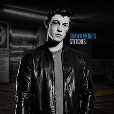
Marshall Bruce Mathers III, known professionally as Eminem, is an American rapper, songwriter, record producer, record executive, film producer, and actor. He is consistently cited as one of the greatest and most influential rappers of all time and was labelled the "King of Hip Hop" by Rolling Stone magazine. Eminem had recently take a break form his rapping career but has now returned with a bunch of new songs. This is why the side line is ‘the comeback that stunned the world. Having a very long unscheduled break and returning to make instant song hits is ‘stunning’.
MISE-EN-SCENE –
I this image we do not see a lot of items which are in the category of mise-en-scene, but we can see that Eminem (the rapper) is wearing an outfit which could be a costume probably because some singers or rappers are given certain costumes for the type of song they will be singing or rapping. In this image we see lighting, we can tell that the lighting is above him as his face is exposed the most as he is looking up. This connotes that he could be in a stage which leads to the thought of him performing live to an audience. The camera angle which was used is a mid long shot – this is from the subject’s knees to his head. This is done because the audience want a close up on Eminem but they also want to see more of his surroundings.
Typography-
The type of fonts used usually create a way of how the readers read it or how they would see it at first glance. In this image we do not see any serif fonts, there are only san serif fonts but this would make sense as the magazine is about the unexpected comeback of a famous rapper Eminem. The fonts used are mainly all bold and all are in capital letters, the use of capital letters is to create how something is said, either its said with excitement or with disappointment. With excitement the capital letters would be included as well as those letters being in bold. This allows everything to stand out on the magazine and says whether its important or not. For this magazine for instance everything is important.
Target audience – Eminem’s target audience is mainly age 13-30 this would make sense because the audience would be neither too young or too old. The gender would no matter, a lot of female and males listen to Eminem and still do, the ethnicity could play a part as Eminem has a certain style of rapping which could or could or could not offend certain people. Eminem has a lot of songs which have different themes to it so this could create more of an audience as some people might not like a certain song but like the other.
textual single magazine analysis 2

DENOTATION –
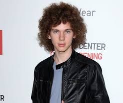
Travis Landon Barker (born November 14, 1975) is an American musician, songwriter, and record producer, best known as the drummer for the band Barker has also performed as a frequent collaborator with artists, is a member of the group , founded the rock bands and and most recently joined and He was a frequent collaborator with the now-late , and together they formed . Due to his fame, referred to him as "punk's first superstar drummer" as well as one of the 100 Greatest Drummers of All Time. This magazine
Mise-en-scene –
In this picture we see that Travis barker is wearing an outfit which could be what he wears during his rock band performances. there are no props in this picture…. for the setting we see a blurry background and this blurry background makes the subject appear more visible. The NVC is the facial expressions of the subject, we see that Travis barker has a straight face which could mean that he is serious. The lighting is somewhat artificial as it appears that he is inside but its debatable whether he is or isn’t, the lighting could be high key lighting which creates a visible appearance for him. the camera angle is a close up which is chest to head, this allows the viewers to see the subject closer
Typography – the text in the magazine is mostly plain but there are some forms of writing which have an element of dirt or rust in them. This could connote to the magazine style being old fashioned. The colour is mostly white and red which doesn’t really bring excitement to the magazine.
Target audience – the target audience for rock music could be very random as rock bands have a very energetic way of singing or playing the songs they make. The estimated target audience could be middle aged males (30-50)
textual double magazine analysis

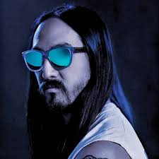
Denotation – this magazine is about music festivals and the main theme would be Calvin Harris (born 17 January 1984), a Scottish DJ, record producer, singer, and songwriter. He is known for his singles "We Found Love", "This Is What You Came for", "Summer", "Feel So Close", and "Feels"
Mise-en-scene –
The costumes in this magazine are just regular clothing the subject uses during his performances. There are no props in the pictures of this magazine. The NVC is the facial expression of Calvin Harris which he has a pumped up face as he is hyping the crowd in the picture. the lighting is low key lighting which creates the atmosphere for the concert. The camera angles that are used are high angle shots and mid long shot which are shots taken from a level above the subjects and shots taken of a subject which are from knees to head.
Typography –
The main font on the magazine cover is a san serif font. This theme does not need any serif fonts as serif fonts are used in more formal and modern magazines whereas this one is about music and having fun times. The quote in the magazine ‘compliment me, I deserve it’ is a quote by Calvin Harris himself which tells us that the article is about him. The colour scheme is very groovy, it has elements of orange, blue, green, red this creates a festival like mood.
Target audience –
The target audience for music and or music festivals can vary as in some music festivals you need to be 18 to enter but the genders can be both, the expected age requirement for Calvin Harris and or other dj’s could be 16-35
textual double magazine analysis 2

Denotation - this magazine is about the music band ‘Gorillaz’-Gorillaz are a British virtual band created in 1998 by musician Damon Alban and artist Jamie Hewlett. The band primarily consists of four animated members: Stuart "Pot, Murdoch Nicholas, Noodle, and Russell Hobbs. Their fictional universe is explored through music videos, interviews, and other short cartoons.
Mise-en-scene – in this magazine there are no props, no lighting as the picture is a cartoon but it has a high key lighting effect. The NVC of the subjects in the picture is positive, one of the subjects are smiling which could connote to them looking forward to something. The camera angle which is used is a low angle camera as the subjects are a level higher.
Typography –
The fonts used in the magazine are very plain, there are elements of black red and white texts. We see no serif fonts, all of the texts in the magazine are san serif fonts which makes the magazine cover very basic and boring.
Target audience – the target audience for this theme (the Gorillaz band) could be very random, the gender could be any, male or female but age could be 12-30
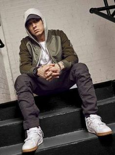
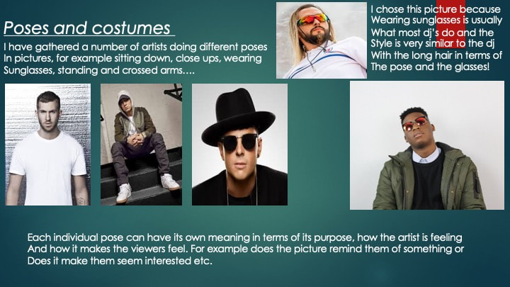
poses and costumes
HAND GESTURES

|

|

|

|
Gestures are a form of nonverbal communication in which visible bodily actions are used to communicate important messages, either in place of speech or together and in parallel with spoken words. Gestures include movement of the hands, face, or other parts of the body. but nowadays hand gestures are used in multiple way and each gesture could have a visual meaning as well as a meaning in text. hand gestures are very common in photos of artists as the artists usually have a claimed or very much used a certain type of hand gesture which people might know them by or be reminded of the gesture when they hear the artists name.
SITTING DOWN

|

|

|
|
many artists sit down during photos but sitting down is no just an element of comfortability, it allows us to see or try to figure out a persons personality using the way he or she sits as a clue. there are also many different styles of sitting and each one could mean or say something else about the person or his motive.
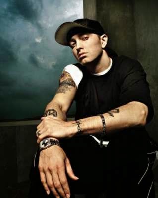
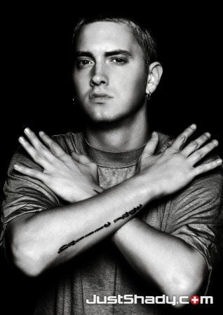
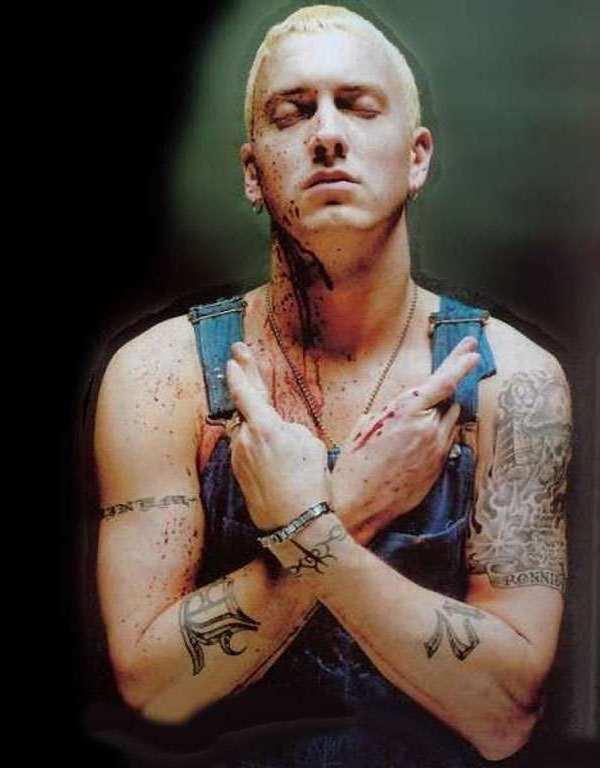
CROSSED ARMS
|
|
|

|
a lot of photos of many different people involve them crossing their arms , this type of pose could have an element of closure due to the fact that crossing your arms usually means that they are closed for argument which acts like a barrier . people could also cross there arms mainly because it looks good with the outfit they are wearing.
NVC

|

|
|
close ups on the artists face gives the viewers a good look at them, close ups usually creates a mood depending on the style of the face. close ups on actors allows us to get an image of what their music is like, the clothes they are wearing could help with that situation.
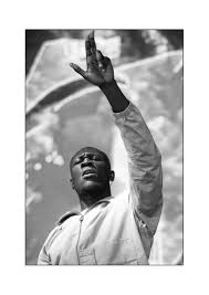
RAISED ARMS

|

|

|
|
raising arms in picture could be used as an element of emotion, maybe the person doing it is happy or he is hyping a crowd. raised arms has a very positive effect to it.
casual outfits
|

|
|

|
Casual wear/attire/clothing is a Western dress code category that comprises anything not traditionally appropriate with more formal dress codes: formal wear, semi-formal wear, or informal wear. ... In a broader sense, the word "casual" may be defined as anything relaxed, occasional, spontaneous, "suited for everyday use".
SUNGLASSES

|

|
|
|
people usually wear sunglasses as a barrier from the sun on a hot day but nowadays sunglasses can be worn and they could have multiple meanings for example they could ad an element of style on the character. sunglasses are also used to hide the persons eyes so we never know what they are up to which includes an aurora of curiosity round them.


magazine production

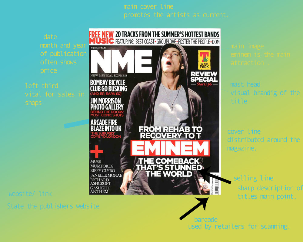
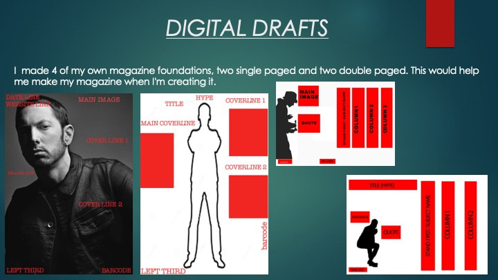
Currently for my single page magazine cover i have applied the basic conventions
and added simple boxes to represent where each convention will go and what that convention will be. I know that i need the change the fonts in the future because the classic white and red is too standard and i want a font/colour which
can stand out due to those two aspects.
and added simple boxes to represent where each convention will go and what that convention will be. I know that i need the change the fonts in the future because the classic white and red is too standard and i want a font/colour which
can stand out due to those two aspects.

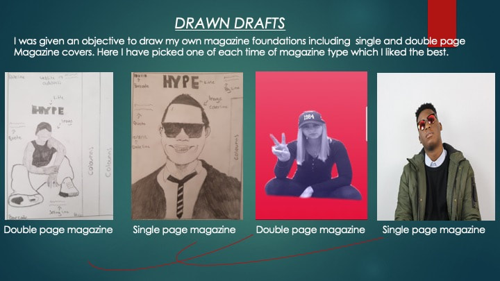
As i progressed i have added new conventions into my magazine single paged cover, i have also changed what the background of these conventions as my magazine background in the future will be white and the two colours will mix together and i also have a new font which will be in the net update

I have now aded my on site background to my magazine , i have added my custom HYPE font for my magazine cover as well as a number of magazine conventions with the blue and orange colour which goes with the white background. I also added in a barcode on the magazine to add a realistic affect to it. Currently i have yet to decide a colour because i want one which connotes to a lot of positivity around the magazine in terms of how enlightening the magazine will be.

I have now added in margins to my magazine outskirts to help me
position where the magazine will be cut off and where i need to move my magazines conventions. i also have rotated some pieces of my text to create something new to look at rather than simple texts.
I have added in a custom logo to represent this magazines genre and its visual representation. there is also a quote from the artists which gives the readers something to be interested in as to what the artist wants to say. and i have added in logos of other social media platforms which tells the readers that this magazine is spoken about and has its own media on these platforms. currently the colour scheme is good due to the fact that there is not too much red and there is not too much black which does not make the magazine plain. In the magazine i have included a masthead, cover line, selling line, main image, dateline, barcode and a QR code. i did not have the text to close to each other because i wanted the readers to look around rather than having everything in one place.

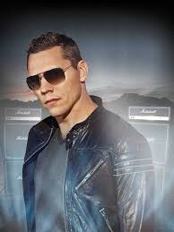
I have added in another selling line 'number 1 dj' this would add interest to the readers i also have added in a signature to make a more personal
effect to the rapper. 'his signature, his approval'. All magazine conventions have been added in. I have added in some logos and shapes near the masthead which will catch the readers attention to it as they will be looking around it at said logos and shapes.
effect to the rapper. 'his signature, his approval'. All magazine conventions have been added in. I have added in some logos and shapes near the masthead which will catch the readers attention to it as they will be looking around it at said logos and shapes.

I have removed some shapes and repositioned my logo and re sized my masthead. I have aded in some rectangles which go through my mast head but they are behind it which creates a more visual effect to the title of the magazine. I have also used the eye dropper tool to change the colour of the rectangles into a darker red so the HYPE masthead is the brightest red and the biggest on the page. I have made it so not everything is s close together, making it look like an actual magazine.
the darkish red connotes to courage and this goes with my magazine which is about an upcoming dj who stood out and started from nowhere and ended up where he is now. I have included many the conventions that make a magazine a magazine and therefore I think that with these conventions installed within the magazine it makes it stand out as well as blend in so I think that this magazine is unique due the fact that it stands out in many ways. I have used many tools in photoshoot to create this magazine this includes the magic wand tool, to crop out certain aspects and make it fit in with the magazine and I have rasterised only some of the layers because I don't want everything to be the same I want difference in this magazine which will impact the readers views on it in my opinion.
the darkish red connotes to courage and this goes with my magazine which is about an upcoming dj who stood out and started from nowhere and ended up where he is now. I have included many the conventions that make a magazine a magazine and therefore I think that with these conventions installed within the magazine it makes it stand out as well as blend in so I think that this magazine is unique due the fact that it stands out in many ways. I have used many tools in photoshoot to create this magazine this includes the magic wand tool, to crop out certain aspects and make it fit in with the magazine and I have rasterised only some of the layers because I don't want everything to be the same I want difference in this magazine which will impact the readers views on it in my opinion.
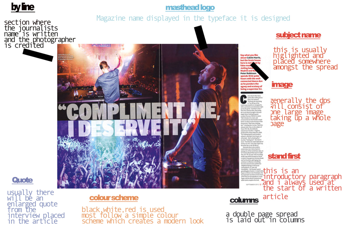
double page cover magazine.

For this double page i have included the basic conventions
for the magazine as well as the main image. the columns might not be where they are in the final magazine.
barcode, quote, main image, column 1, column 2, column 3, by line.
for the magazine as well as the main image. the columns might not be where they are in the final magazine.
barcode, quote, main image, column 1, column 2, column 3, by line.

I have replaced some of the conventions with the real icons/conventions that i will be in the magazine finale. Including my masthead/ magazine logo and date. next update i will arrange what i can and make those things stand out together with the colour i chosen. I want parts of the magazine to be more enlightening than the other parts and i will do this by re sizing, changing font to a font which creates a clear view. and colour which connotes to
some positive things.
some positive things.

Here i have changed where i will be including where i will be applying my texts.
i have used the eyedropper tool to make my masthead in front of the rectangles by rasterising the layers then applying the eyedropper tool onto the masthead.
i have used the eyedropper tool to make my masthead in front of the rectangles by rasterising the layers then applying the eyedropper tool onto the masthead.

Here i have added in shapes which will help me with the positioning of my double page article question and answers. I have also made the shapes the same height/ length to maintain alignment with the text within. I have also aligned my texts to make everything straight . This will make the magazine look professional and not all messed up.i also have added in two big chunks of writing which will give the readers something to read as well as looking a the visuals in the magazine. I might also change some of the colours in the magazine which would highlight different areas of said magazine. In the magazine i have included questions and answers and i believe that the answers will intrigue the readers as they will or might find the responses to the questions rather interesting.

Here i have rasterised multiple layers so i could give them a customised font. ( white to red and black to red) which is seen on the masthead and the borders
throughout the magazine cover. I have done this to add some difference onto my magazine and not for it to have a plain colour like red. This creates a good visual effect at it may interest he readers that much more. The fonts also make it so it looks like everything stands out and this effect will allow the readers to be more curious looking through the magazine or the cover.
throughout the magazine cover. I have done this to add some difference onto my magazine and not for it to have a plain colour like red. This creates a good visual effect at it may interest he readers that much more. The fonts also make it so it looks like everything stands out and this effect will allow the readers to be more curious looking through the magazine or the cover.

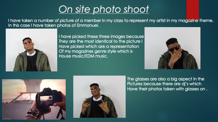
Here i have added an image of my artist and i have made it
so it look like he his leaning onto the edge of the magazine and pointing a one of the texts . I have used the magic lasso tool to crop out the person from the surroundings .
I have also rearranged the barcode/social media logos to the side of the magazine to make it look better. i need to include the page numbers and the drop capital which is important
for double page magazine texts.

For my last update i have added page numbers and i have also added in a drop capital for the texts. I have included signature to show the readers that that is his signature. Making the magazine in a way more famous.
I have used red for most of the magazine because red connotes to courage and the white connotes to purity.
I want to make this magazine as positive as it can be.
for this double page magazine i have included many conventions which required different tools from photoshop for example i have rasterised layers for the masthead and i have used the magic lasso tool to cut out my artist from his background and placed him on my magazine. I have learnt how to do the drop capital and how to change the type of fonts on a text (masthead) i have included many of the conventions both basic and advanced to make my magazine contain as much as a normal magazine would whether thats selling line, subject name, man image, quote, barcode, masthead, page number, columns. i have what ever is needed to make a magazine a magazine
Evaluation
Single paged magazine - As i have finished my magazine i have thoughts on what made it good and what i could have improved on it. My single page magazine was my best one out of the two because of its layout. I had found a good layout to the magazine and that made the single paged magazine my favourite. My single paged magazine involved a lot of good conventions which made it look good, the layout was not too much and it also wasn't too little. This would be good as the viewers would find it interesting. The typography was good and it went with the colour that i had picked for the magazine . The mise en scene was not over used in the magazine because it would make it boring or just too much.
double page magazine - After my completion of my double page magazine i have realised what made it good and what didn't. The mise on scene was quite good as it was not too close together and that would make the viewers have to look round the magazine to read what they want to read. The image was good because i had it cropped and i made it so it would look like my artist is leaning on the side of the magazine .The text were not as good as i expected them to be, they didn't look similar to each other and that made the cover look unprofessional. The logo of my magazine was good and for the double i had made it so the logo would be cut by the two pages by placing it in the middle of the margins. Some of the social media icons also did not look as good as i wanted. But some of the conventions were good in terms of there positioning in the magazine.
